All a man needs out of life is a place to sit ‘n’ spit in the fire.

Category: Art (Page 1 of 2)

What is art? All the debate that’s fit to print goes here.

Art Matters: A Case For Community Expression

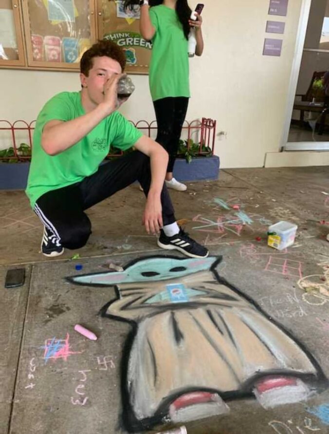
Javier’s art teacher asked him to draw something for the school field day. Ever the creative munchkin he is, he got together with his friend, Lorenzo and drew a baby Yoda as a work of public art. Classmates gathered around, commented, laughed, played, shared. Javier solicited ideas from the group and incorporated them into the drawing. When they were done, the public space was reclaimed by the rain and trampling foot traffic.

The little group coalesced, created something fun and delightful, and left the situation better for it. There was no physical artifact left, the chalk long dissolved, but the experience, a tangible connection was carried away from that moment. Javier helped foment community, expression, social awareness, culture, and friendship.

“You know, Javier, I think it’s really neat what you did. It’s a shame that art isn’t more valued in society. I wish that artists were more valued. I wish they could earn a decent living without having to scrap and save. People just don’t know how much they need art and artists in their lives.

Look at what Hasan Minhaj talked about on his show, Patriot Act, last night. Why do you think so many people have fallen victim to opiates and addiction? There’s this malaise, this existential crisis, some kind of void that people can’t fill, so they numb themselves from physical and metaphysical pain.

Individuals don’t seem to be acutely aware of how important art in their lives. Sure, they get hungry and buy food or other physical artifacts. Maybe we don’t value it because it doesn’t satisfy a physical need or some compulsion to hoard for later. But even though art may not be physical sustenance, it feeds us in ways we don’t realize.

We are starving, emaciated, and ravenous from a hunger so potent that we are literally willing to die for it. We feel something, but don’t know what to call it. We address that emptiness with more emphasis on concrete subjects like science, technology, engineering and mathematics (STEM).

Busy yourselves, we are told, step back, don’t think so deeply about things. Get on about the work, productivity, distract yourself from your pain by activity. Best not to think about all that touchy feely, philosophical bullshit. It’ll just keep you down.

We are not automatons, meant to produce widgets for profit all the days of our lives. We need to share in creation. We need to have a space to both create and enjoy the creation of others. Instead of zoning out, distracting, forgetting, we need to remember we all in it together, and that when we come together something wonderful happens. Musical performance. Public art. Community art. All these things enrich us in ways that are not immediately apparent, but no less important.

From Our Ongoing Discussions About the Nature of Art

What is art? Laura and I have been discussing this subject passionately for the past twenty-something years. I can’t say we’ve arrived at any firm conclusions, but let me throw one more log on the fire right here.

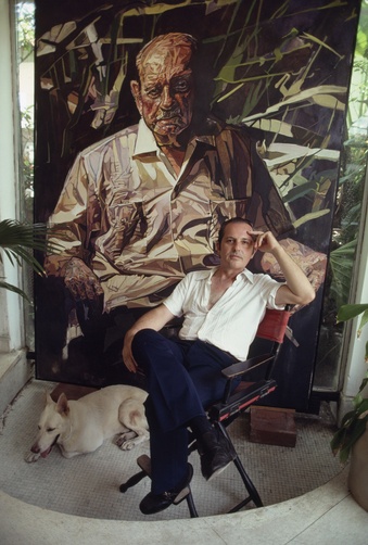
We were visiting the Art Museum here in Puerto Rico a few months ago and I found myself in front of this painting. Here’s the best image I could find with the artist, Francisco Rodón.

2cbdbf8af0d004be72a9d8dfd36685fe

So I walked up a winding staircase and came upon this huge painting of Luis Muñoz Marin, first elected governor of Puerto Rico in the Puerto Rico Art Museum. I was moved. It was beautiful, exquisite, composition, colors, impactful. First there came a slight choke, then full on tears running down my face. This is silly, I thought. What is wrong with me? Am I having a stroke or something. Sheesh, get a grip, Jim. I wiped my eyes and tried to focus on the details of the portrait, the rivulets of color flowing and gathering in little pools and the patchwork of earthen colors, like seen from high above, farmland, the very face of Puerto Rico. I peered into the tired eyes of Marin. I have done so much. I have seen so much. I am tired. I wish I could have done more, but I am old now. There is pain in the painting, palpable pain. But it is beautiful too, compelling. I could not tear my eyes away as I experienced the entirety of Puerto Rican 20th century history.

I didn’t try to dissect it in that moment. I couldn’t, a mess I was, overcome with what poured out like a tidal wave. It was all I could do to just stay afloat for the ride and try not to drown. It wasn’t until a few months later, reflecting on the experience, and after attempting to explain it others, that it hit me.

This piece is beauty and pain. The best art, like life, is beauty and pain.

To contrast: too beautiful, too pretty, too sweet; it’s a simple gumdrop, a sugary treat bursting in your mouth and gone. Shallow sentimentality doesn’t stay with you, does it? It won’t nourish you. At best it’s a way to mark time, a momentary distraction. Here we have majestic paintings of mountains, beautiful morning lit scenes leading to a little brook, and some pretty flowers. It’s nice, and matches the drapes too. Would that work its way into your soul?

Rodón, could have done this painting much darker, austere desaturated colors, darker shadows, sunken eyes. He could have rendered the patches all angular and jagged. He could have scrawled some political slogan across the middle, an ugly reminder of tribalism in politics. He could have defaced it to “really get in your face.” He could have done so many things if all he wanted was to thrust pain and dissonance upon us, but he knew that there was beauty there too. He painted with such tenderness for Luis Muñoz Marin. Cariño. He made me see beauty in this old man after his life’s dedication, of the battles won and lost, of progress, of mistakes. It was worth doing, but it was hard.

Now, too painful, too cynical, and you risk losing yourself to despair. And suffering for suffering’s sake is a pointless exercise. It will find you, trust me.

Think about art, and if you are honest with yourself, you will find that it does need to be beautiful. It needs to be terribly beautiful, not pretty with little pastel sailboats hung over a couch, but terribly painfully beautiful. And it must challenge you, but not for the sake of shock alone. Art shouldn’t just throw shit in your face and say, see? that’s what shit smells like. Isn’t it shocking? Too cynical, and it loses its measure of humanity. Pain is real, and all people know it. We humans are acquainted with pain in all its varieties. Art should elevate the dialog of pain, not just use it like a cudgel. That is for the lazy and the shallow.  An artist’s job is to capture authenticity, and it takes a reverence and sincerity you can’t fake.


On the Death of Journey Sentences

This has been sitting in my drafts folder for over two years (Feb 19, 2006) – time to publish, I say!

You’ve all read them; they are what I like to term, “Journey Sentences.”  They are the typical sentences from the earlier part of the 20th Century and before. Most them would start out like the following:

Having all the deftness of a barnacled fishing trawler and half the wit of a common ordinary housefly, which is to say, not a lot, and wishing to keep up appearances so that should a potential suitor ever be quite so oblivious to said traits and stumble or perhaps bumble might trip and land with such a thud as to cause an impression upon the earth from which his posterior might never escape, Grace quietly nibbled on her egg salad sandwich.

Hah! that was a hoot.  Look, I don’t even know if that was grammatically correct or whatever, and frankly, I’m not going to go back find out.  You get the point.  But ahh, the journey sentence, the sentence which begins and ends you know not where.  Half the fun was the journey and the folly.  Might you reread the sentence, absorb its richness for clever clues as to vistas one might find along the windy path.  Lovely.

Who has time for that?

In today’s society with its fast pace and ruthless efficiency, we have no time for journeys.  Where are we going?  We ask.  Tell me now, dammit!  I don’t have time for your foppery, your magic journeys of butterflies and candy coated magical literary foreplay.

Let’s just get to it, shall we?

Perhaps this style of prose had its place long ago when the well-placed and small gentry of leisure had more time on their hands. Reading was idle time, time for relaxation.

Then: They wrote these crazy mad sentences.
Now: We watch people eating bugs.

Or maybe the world was so arbitrary and ruthless that literature just reflected what was familiar.  Whether rich or poor, you or your kids/wife/husband might be dead in a week from some fever, infection, or God’s will.  You didn’t know where it was going or when it might end, so you needed to be vigilant in all moments.  Literature might have reflected the capricious nature of life.  Meandering verbiage reflected what was known of the world and our control over it, which is to say, not much and very little.

I note with amusement that Spanish speaking people still have a tendency to write this way in English as they do in Spanish.  There is a taste to the words, something intrinsic to them that renders them uniquely  important not just as constructs of a sentence.  Their order, the languid pace, the setup, the tendril-like clauses that reach out in all directions pushing and pulling and twisting all feel like some kind of full sensual body massage of prose.

Is it a Catholic centric culture that shows less willingness to own the future?  It is not my place, I might say.  I am but a conduit.  The journey is what it is, to endure, to accept the way as it unfolds according to God’s plan.  Should it transpire too quickly, all enjoyment, all suffering, and by default all Grace is lost.

I’m not sure I buy it myself, but it does explain a lot.

Gutenberg.org

I’ve been using and abusing Gutenberg.org a lot lately.  It’s a web site dedicated to public domain books, mostly in English but there is variety in other languages too including Beowulf in Old English.  You can basically find anything you want that was published before 1923.  They have ebook formats, pdfs, html documents, and a lot of audio books submitted by supporters.  All the classics are there.

I’ve been reading Edgar Rice Burroughs’s Tarzan and John Carter of Mars books to the kids at bed time.  I loved those books as a kid and now despite limited library space and an unwillingness to store any more books in this house, I can read the classics to my heart’s content.

So here’s the work flow:  Download a book at gutenberg.org, open it up in konqueror or firefox and when you come upon a strange archaic word pop it into your kdict public domain dictionary reader and peruse several different definitions and usage entries.  I’m simply amazed at how awesome the public domain is and how many volunteers have come together to make it all possible.  Consider donating to gutenberg.org.

I just noticed that the character of Tarzan went into the public domain in 1998.  Is it a coincidence that Disney’s movie was released in 1999?  Hmmm.

Good Art

I was at a client’s office working on their office server this Thursday.  In addition to all the crawling around under tables and dealing with cables, switches, and routers, I also have been re-creating their website.  I was getting short on photos.  “Do you have any more photos I could use?” I asked their accountant/onsite help desk guy, “I’ve exhausted all of the ones I’ve shot myself and I need some more.”

“Oh yeah, we have tons,” he replied, “One of our members is a photographer.  He has a photography firm and he takes all the pictures for us.  El es un fotografo buenismo y toma fotos increibles.  (he is a really good photographer and takes incredible pictures). I’ll burn you a CD.”  And he disappeared to his computer and the burning.

I went back to trying to figure out why Samba had decided to stop working, dumping core, and refusing connections.  Bizarre. It was doing something all right, just not what it was supposed to do.*

After a few minutes, he returned.  “Here,” he said, dropping the CD in my hand, “This is from an event from last week.”

I opened my laptop and anxious to see these beautiful photos, clicked it into the drive tray.  After hearing all about the photographer and his mad skills, I prepared myself for a huge pile of awesome photos for the website. This was going to make my life easier.  I’ll have more to choose from.  I opened the CD and started browsing.  I furrowed my brow.  “These photos aren’t really all that good,” I said, “They’re kind of bad, actually.  I thought you said this guy was as good.”

“Oh, I’m sorry, those are actually photos I took.  I have a crappy little camera.  They are just snapshots.”

“Hmm,” I replied.  “After all the talk about this professional guy, I was worried.  Okay, I’m glad.  Do you want to know how to make your shots better?  You could improve a lot with just a few simple tips, even with a crappy camera.”

“My wife takes nice pictures,” he said. “Her photos are a lot better.  She has a lot of artists in her family.  Her brother is an artist.”  I could tell he was a little embarrassed by my accidental bluntness.  But, hell, I’ll just go with it.  I am not a mealy-mouthed type.  He could spent the rest of his life taking shitty photos and never have anyone give him any pointers “to save his feelings,” but I wanted his photos to say something or at least fake saying something, anything but stand still.

“Yes, an artist probably has some formation and training for using the space and telling a story, showing action or whatever.  I have a couple of basic tricks to go from beginner to amateur.  Do you want to know what they are?”
rule-of-thirds

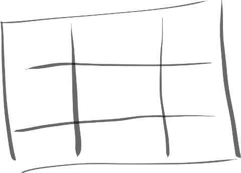
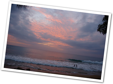
“First, is the rule of thirds.  It goes like this.  Take your canvas and divide it into thirds, horizontally and vertically.  Your intersecting points are interest areas.  For example, why do shots of the ocean always fail to live up to the moment?  I’m sure you’ve taken lots of shots of the ocean, beach, la isla, and they never come out the way you remember them, right?”

“Yes, pictures never capture how beautiful it was,” he agreed.  He was shuffling his feet and seemed to be losing interest.  They are forever polite and have little capacity to deal with uncomfortable moments.

Hang in there a little longer, and I’ll have you fixed up, I thought.  “Okay, so a little trick for the ocean is to make sure that the sky always takes up either one third or two thirds of the frame.  Never half.  If the ocean is two thirds, the sky is one third.  If the sky is one third, t­he ocean is two thirds.  If the ocean is in the middle, the way your eye perceives it, you end up with a boring shot.  The shitty picture that you all know and ends up in a box with the thousands of others.”
rincon_0134_sm

I continued, “If you are shooting people, make sure you get close.  If it’s a group, apart from a planned group portrait, try to focus in on one or two people.  Basically, just get closer.­  When in doubt, get closer.  Those are my two tips, and they will cover 99% of circumstances.  As you improve, and believe me, I’m no professional, you can break these guidelines.  But to start out, they’ll help you turn snapshots into art.  Really great photographers ca­n tell amazing stories with bigger groups, more complex elements, and from farther away, but the beginner doesn’t know how how to balance so many things at first.  Just be patient and get closer.  Stick to one or two elements and tell a simple story.”

­­­2007_camp_eureka_0088_cropped_sm

­”Okay, thanks James,” and he excused himself.  I could tell he was only being polite.  It’s probably why his pictures will continue to be shitty.  But that is another story.  I decided that I was going to write down what good art looks like, feels like, and is.  Since I’m a multi-disciplined person I think I am qualified to define what makes good art in a variety of media.  I think I can even tie it into what makes a good battle plan and a good life.  I use the word “good” because to be “great” you’ve got to dedicate yourself to one thing.  To be merely good, requires only a little bit of passion and purpose.

So let us begin, shall we?

The photography/graphic arts “rule-of-thirds” is really just a trick.  You trick your viewer into believing something is happening in the frame.  Take the sky and ocean example.  Put the ocean in the middle and it is stagnant, locked in stasis with the sky, a stalemate, neither giving nor receiving.  The sky and ocean just sit there.  The photo says nothing and gives nothing either way.  Should, however, the sky yield to the ocean or the ocean to the sky, now you’ve got something.  Movement.  Purpose.  It is small, yes, but with the ocean spilling into the sky or the sky pushing down the ocean you have begun a process  It is this something, this movement, that makes the picture interesting.  Bingo.  It’s not the greatest picture in the world, but neither is it the worst.

Instead of shooting a person right smack in the middle of the shot, put them off to one side.  Which way are they looking?  Are they leaving the frame, or entering it.  If they are in the middle, most of the time it’s a boring photograph because the perception is that nothing is happening and the space around the sub­ject it distracting or wasted.  Maybe you should crop it or get closer or offset the subject.

­javier_and_asier_0013_sm

There’s a lot of clutter behind, little Mr. Asier, but instead of putting him in the middle frame with clutter all around, I have his motion moving in frame with the clutter blurred and de-emphasized.   A great photographer might have planned this better, but sometimes you just have to shoot what you have in front of you.  With a few simple tips you can turn ho-hum snapshot into something you and others will adore.

Beginning writers are told to show don’t tell, to use adverbs sparingly.  Don’t tell me about what someone said or did.  Show me.  If someone was sad, don’t tell me:  He was sad.  Show me how he was sad.  And don’t say:  He walked sadly.  Tell me he walked without picking up his feet and the sound they made as they dragged over the dirty floor.  Tell me how his clothes drooped, or how his hair was flat and oily or how when he answered questions he mumbled or looked away and didn’t meet your gaze.   The key is that good writers can take any subject and make it interesting and put you in the moment.  Take this passage for example about coming home, sitting on the toilet and through a simple discovery realizing true love.  Sonny, true love is the greatest thing in the world. Except for a nice MLT: a mutton, lettuce and tomato sandwich, where the mutton is nice and lean and the tomato is ripe. They’re so perky, I love that.  But I digress.

From http://sigg3.net/:

Thinking about this, I smiled as I made my way up the godforsaken five floors I have to climb every fucking day to get to the apartment. I got inside, put the groceries down and headed for the bathroom. It felt good, if you have to know. (And reading this, I suppose you do.) Went back into the kitchen, picked out the beer and put ’em in the fridge, put the frozen pizza on the table and turned on the oven. That’s when I saw it. At first I couldn’t believe it, it just couldn’t be true. Was it really real? I swallowed solemnly while revering every inch of the realization that crept upon me like a slow sunrise in the time frame of geological foreplay.

Lady C had actually taken out the trash.

All of it.

All by herself.

from: http://www.sigg3.net/b2.php?p=1346

Note the spare use of adverbs, the build up, each mundane detail, the slow difficult climb, taking a dump, putting some groceries down, and the frozen pizza (how clever).  Each serves as contrast to the final realization: LOVE.  But not just any love.  Our writer has cleverly placed the ultimate force of the universe within the confines of a small act of refuse disposal.  Doubly clever.  Touché.  It doesn’t get any better than that folks, and is basically the rule of thirds.  Contrast, movement, purpose.  Some people do it naturally, some do not.  The key is, however, anybody can learn this.

A little imbalance allows your electrons to flow.

Nature abhors a vacuum.

There must be movement.  Movement for movement’s sake is okay for the amateur, but your goal is purpose of course, willful story telling.

If you had to sum up good art in one word it would be “contrast.”

* it ended up being a GCC 3.4.6 hardened compiler problem.  I don’t now what specifically, but after upgrading to the 4.x series GCC Samba stopped dumping core.
Cleaning to Stravinsky

You know what makes a great cleaning song?  – Tableau IV. Fête Populaire de la Semaine grasse (vers le soir), the fourth act of the ballet Petrouchka by Igor Stravinsky.  It’s a series of lively dances, triumphal, tragic, fanciful, and full of folly – much like my kitchen in all its disasterous dimensions. 

Within my kitchen, there is the toil of the ants scouring the counters for small crumbs to take back to their lair and feed their families.  I know too well how they shall never again see their homes as I crush them and wash them down the sink. 

Then there are the remnants of the children with their messy plates, forks, glasses half full of liquid.  Their little spirits are too lively to sit still for more than a moment, yet their bodies are small, incapable of pacifying the mess of life.   They make do as best they can given their small statures.

Laura too is represented here in the menagerie, for all that we consume was created by her hands, lovingly prepared for us without reservation.  There are the burned pans, stuck rice, splatters of oil and tomato sauce.  Disorder is an unavoidable bi-product of creation, I think.

Would it be better for the magician to have never brought this kitchen to life?  The tremendous gift that is a kitchen comes with an inevitable cost: The Cleaning

Is a kitchen worth it?

Someone send me a maid!

HDR Photo Forays

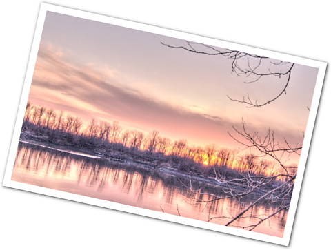
I’ve been messing around with Qtpfsgui, a High Dynamic Range (HDR) photo tool for Linux, Mac, and Windows. There are number of processes that on­e can invoke to increase the dynamic range of photos from RAW captures or multiple tripod exposures, but first, an example.

This was taken at dusk at a hotel pool in Rio Grande, Puerto Rico.  Very scary sky.

The basic concept is that your camera can’t really capture a bright sky with a dark landscape.  Set the exposure for your land, and the sky is washed out.  Lower your exposure for the sky, and the land comes out too dark.  Wouldn’t it be nice if you could combine the two and fudge the photo to look more like your eye sees it?  The best way is with a tripod and multiple exposures with different settings, but I’m lazy and I want results NOW.

If you’re shooting RAW in your digital camera, you can capture a little bit more dynamic range than what you see when you export it to a jpg.  Try using an HDR tool to pull out a little more dynamic range or, in my case, heavily process it to give you that funky black velvet painting effect.  Meh, whatever floats your boat.  A lot of people seem to like these images.  ‘Course people seem to loathe them too.

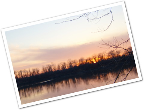
The original photo looks like this:

It’s a nice photo, but the first one is quite dramatic, no?

Here’s another dramatic shot of the Mississippi and Missouri River confluence, shot on a cold day in December from the Missouri side.

My Christmas Card Design

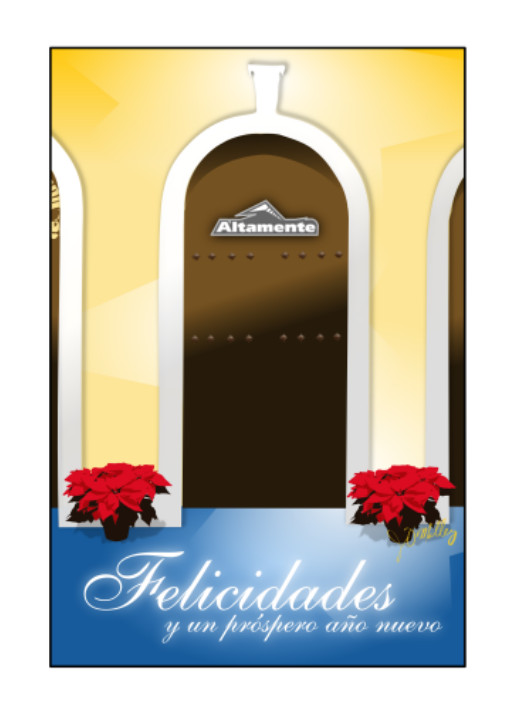
I had been itching to do some artwork for a Christmas card, both for personal and our company, Altamente. I tried a bunch of things, but ­I settled on this: ­altamente-christmas-card-page1-front.jpg­

We did a short run at a local printer.  Turned out very nicely.  I printed the friends/family one at Shutterfly.  I ended up being happier with the local printer.  Next time…

I wanted something that was typical to Puerto Rico, communicated home, holidays, but wasn’t wintery or traditional. It would be silly, of course, since we live in the tropics. Not all Christmas seasons are winter wonderlands. Personally, I’m not too keen on religious themes either. Not that I don’t like them, it’s just that their export is not as easy as one would believe when your clients (this card above) and friends (another card that doesn’t have the "Altamente" logo) are all over the map. I wanted them to get a card that they could happily put on their wall and enjoy, something different but cool. It turned out nicely, I think.
altamente-christmas-card-page2-right.png

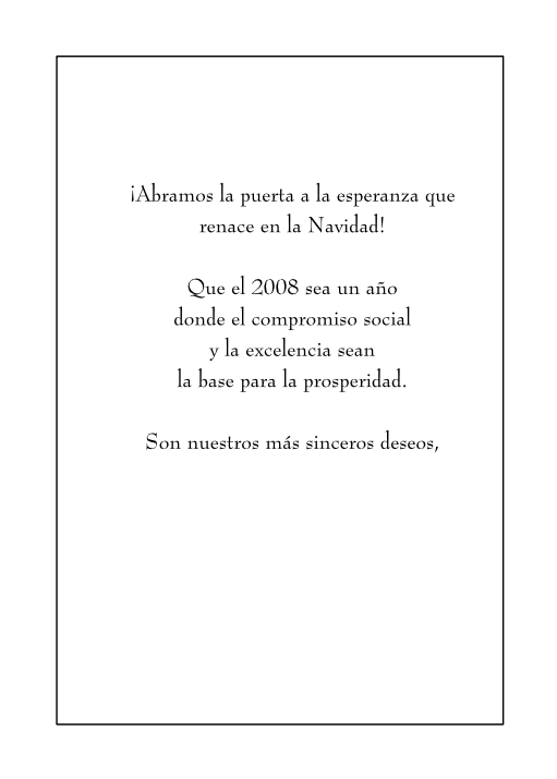
­May we open the door to the hope that
is rebo­rn during Christmas. ­

That 200­8 b­e a year
where social commitment
and excellence are
the foundation of prosperity.

These are our most sincere wishes,

It sounds nicer in Spanish. Laura came up with that text. I used a font called BernhardMod BT.  I liked the way the taller letters and capitals are much taller than the lowercase.  There was something about this serif font that evoked elegance and an Old World feel.

altamente-christmas-card-page1-back.png

­

altamente-christmas-card-page2-left.png

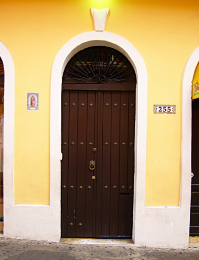
­Typical D­oor
Spanish Colonial Style
Old San Juan, Puerto Rico.

Taken from this photograph by me.

2007_01_21_fiestas_de_san_sebastian_0038.jpg

I always snap pictures of these doors in Old San Juan. ­­­Anyway, I did the drawing in Inkscape and print layout in Scribus­. ­

« Older posts

© 2024 El Gringoqueño

Theme by Anders NorenUp ↑